
The Dashboard That Said Everything Was Fine Right Before It Wasn't
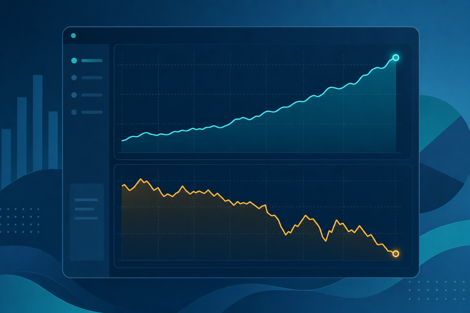
The dashboard that said everything was fine, three weeks before it wasn't
Most dashboards are full of lagging metrics dressed up as health checks. Revenue's up. Users are up. Everyone nods, closes the tab, moves on. Then six weeks later revenue drops and nobody saw it coming, because the metric that would have warned them wasn't on the dashboard at all.
Revenue is a lagging metric. So is total user count, so is last month's churn rate. They tell you what already happened. They don't warn you about what's happening right now, underneath the surface, before it shows up in the numbers everyone actually watches.
That's the gap the Find the one metric that actually predicts whether your business is healthy prompt is built to close. One conversation with an LLM, and it hands back the single leading indicator that fits your specific business model, not a generic KPI list copied from a SaaS metrics blog.
A worked example
Say you run a subscription box service. Your dashboard currently tracks monthly revenue, subscriber count, and last month's churn. All three look healthy. You feed those into the prompt along with one detail: a time when the numbers looked fine but something felt off underneath.
You mention that a batch of new subscribers churned right after their second box, not their first, which didn't show up anywhere because your churn number is a monthly aggregate.
The output walks through which of your three metrics are lagging (all three, it turns out) and proposes a real leading indicator: second-box open rate, tracked per cohort, per week. It explains the mechanism plainly. Subscribers who don't open box two rarely make it to box four, and that drop happens weeks before the churn number moves. Then it tells you honestly that tracking this means instrumenting box-opening events, something you're not currently doing, so there's real setup cost, not just a metric swap.
Where the value actually is
The real output here is the reasoning connecting a leading indicator to an outcome, specific enough that you could go build the tracking for it tomorrow. A generic "top 10 SaaS metrics" list can't give you that, because it doesn't know your business model, your churn shape, or the one anecdote where a metric misled you without anyone noticing.
It also won't force an answer that doesn't fit. If your current metrics genuinely are the right ones, a good run of this prompt says so instead of manufacturing a new metric to seem thorough.
How to use it
- List what you currently track on your main dashboard, and think of one moment a metric looked fine while something was actually wrong.
- Paste both into the prompt along with a one-line description of your business model.
- Take the proposed leading indicator to whoever owns your analytics and scope the actual tracking work before you commit to it.
If you're building a whole dashboard rework instead of one prompt, browse Prompt-King's full library for the rest of the business strategy and data analysis prompts published this week.